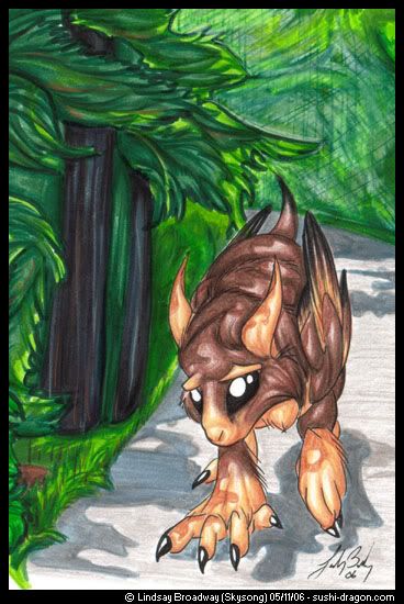
It's marker and pencil crayon (which I've never tried together before), with a *gasp* background (which I rarely do), and with both 'different' lighting and foreshortening! Gasp! Any feedback much appreciated, since I'm trying to learn how to get better at all these things ^__^
Oh, and the Enkeyn there is Eko, from my NaNoWriMo novel. Poor guy's been having a rough day..
Last edited by Skysong on Wed May 17, 2006 9:34 am, edited 1 time in total.
He certainly looks like he's been having a rough day! That's one thing that I love about your art, just how you get across emotions in a face that bears very little resemblence to anything humanoid!
The marker/pencil crayon combo makes the image very /rich/ looking--a lot moreso then when you use pencil crayons alone. I think you should stick with this and hone this ability down, you've really got something!
I don't like the furthest part of the background, with the cross-hatching. I think that if you had left that part out, and done only the vague greenery that seems to be under the cross-hatching itself, it would have looked much better. Backgrounds are supposed to get more indistinct the further away they are, and the lines, there, ruin that effect.
As for the tree-like shading on Eko, I would like to see more variety in the colours that you're using for the darker parts. Purples and blues really help a shadow 'pop', and I think that this picture would benefit from that, on the Enkeyn especially. The colour of the road-shadows looks particularly nice, that bluish colour really works there. I think the best way to improve those general shadows (especially around and under the Enkeyn) would be to make it more apparent that it's /his/ shadow, as it looks very vague right now--his right paw is giving me an illusion of 'floating', since the shadows don't /quite/ seem to line up. (XD kind of like in 3D game models sometimes, if you've seen that before!)
All in all, for working with so many new variables all at once, I think you pulled it together nice and tight, and your knowledge of how to use colour, especially in the trees, really shows. I'd like to see what the image would look like without inked lines for Eko, but that's just my curiosity.
Keep it up! I'd like to see where this mixed media takes you!
I'm definitely going to be trying the marker-pencil thing more.. it was certainly interesting, and yay for markers being able to fill in large spaces of color more quickly than the way I do it with pencil crayons!
The furthest part of the background was a complete screw-up in several different ways >_> First I tried doing the foliage there like in the foreground, but before I got around to adding the details I realized that wasn't going to work.. so then I tried blending it all together with a light green, but that didn't work.. then coloring over it all with a light green pencil crayon, which also didn't work.. then white.. then finally the crosshatching in a sad attempt to cover it all up XD; I'm most likely going to be cutting it out completely and either replacing it with something else or just leaving it blank when I get around to framing. While a big white space isn't the most ideal thing to have there, it's better than the ugliness that's there now XD But at least I know what NOT to do in the farther-off background now!
Hmm, I like the idea of purples and blues in the darker parts.. Eko was done entirely with pencil crayons, so he didn't get any of the grey-blue marker that I used on the road shadows. I think I'm going to try fiddling around with that later today!
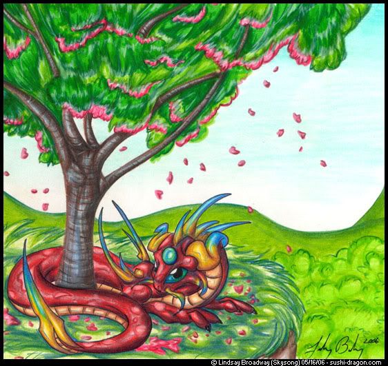
X3 As soon as I saw the picture I got West Coast vibes off of it, hardcore~! Everything's just so /green/ and /pretty/! Not scraggly like out on the east side of the mountains. S'cool.
Good ol' temperate rainforest XD The reference photo that I used for the background is actually one that I took in Stanley Park at around this time last year, when everything's all new and green. I don't think I could ever live over with you prarie folk XD
Love the left side, agree with Dray on the right background.
He doews look like he's had quite a day, looks like he's mulling over somthing in his head.
Wish I could offer some advice of my own, but I'm no artist.
And I have to stop staring at it, it's making me sad...
Yeah the tree is a little.... wormy looking. Perhaps only in the color, but the branches are a little bit 'slick'. perhaps make them a bit bumpier, with the occasional line off without leaves. Other than the tree (and with it, too, because it works just fine without scrutiny) the piece is just lovely. It's more smooth than the first, slightly more realistic in color values. Very pretty in any case.
Wormy-looking? That's a new one XD The reference trees I was going off of of cherry trees (aka, photos taken in the parking lot downstairs) actually did have very smooth-looking branches and bark (til you got up close, at least), but yeah, looking at it again I could have made them more textured.. gragh, trees!
Oddly enough, I like the tree =] With how everything else is smooth looking, the tree looks so shiny and soft... petable tree =D And the dragon under it look so comfy. Haha but don't listen to me. I like very weird things when it comes to artwork. It's very pretty Sky.
dear gods, the quality of the colour is amazing. What are these pencil crayons you speak of? ;-; and you're very good at backgrounds, and integrating a creature into a background, and at poses and angles, too. ;-; asjhdakjshdajdha. Your shading and colouring is delicious, because I equate visual art with food, and that your scanner didn't totally eat it makes me cringe in envy~ ;-; i have to get my paws on some of these pencil crayons of yours.
Aww, thank you! My scenes have been few and far between, but I've been trying to force myself into them lately.. glad to hear it's working, to some extent XD;
My pencil crayons aren't anything special.. I use Laurentians, equivalent in quality to Crayolas. The markers used were also Laurentian - a set of 50 for $7, whoo hoo XD
How do you get the image to scan so nicely? Whenever I scan an image that's been done in colered pencil all the whitespace on the page shows up glaringly and it looks all bleh. Your images I have noticed never do that though.
Hm, well, I just use the scanner's default settings.. I scan in at 300dpi (400% of the actual size, I believe). For images like this with a background, I just crop around the area that I want to show, shrink the image down to 30%, and that's that.
For images that have a white background (eg, Enkeyns), I take it into Photoshop and do a flood-fill in the background of bright, bright magenta at 60-80 tolerance. This clears out the background, and any leftover specks show up clearly against the bright color - they can just be painted over with the same bright magenta. Once it's all cleaned up, then I do another flood-fill of white or whatever the background color is going to be, then shrink it down to 30%.
Hope that helps.. my way's probably convoluted, since I don't tend to use Photoshop often and don't know all the tricks XD
-saves those onto a word document- that scanning tip is excellent too, though I'm not too sure it'd work on my crackhead of a scanner. It eats colours so that something i colour fairly darkly looks like it's been done in liht pencil. -.- :/ That's why i'm so interested in those pencils, they look like they give rich colour. And they're cheap too, so i'll definately be going out and buying me some. ;-; -hugs- thank you thank you for the info.
I like the tree! We have bark like that over here, too, in our Mountain Ash-es. xD The way you have the leaves going, though, might be what's bugging you? I don't know, it looks like they should be very easily influenced by wind, but if /that/ was the case, wouldn't they all be blowing relatively in the same direction, or just hanging limply?
Are those hills supposed to be further away? If you grey them down (more grey for farther away) it might help the foreground stand out more. XD Atmospheric-perspective, and all that.
I really like this picture, Sky! The dragon's pose and expression are adorable, and so are the little heart-shaped leaves. :) Quite a nice picture!