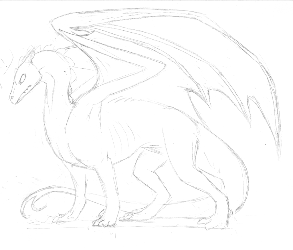
Crit my shi... I mean stuff! :D

Come and show off your masterpieces!

Moderators: Mystic Dragon, Xalia, Shard, Dray

Post Reply
erinnyes
Egg
Posts: 20
Joined: Tue Jul 05, 2011 10:02 pm

Crit my shi... I mean stuff! :D

Post by erinnyes »

So basically, I'm trying to make a new Pernese dragon template, and it's tough! :/ For one thing it's been years since I've sat down and tried to make one, and if anyone knows of an easier way to make a template other than sketching=>inking=>scanning=>cleaning up=>shading=>coloring, I'd love to hear it! Especially if there's a way to skip the horrible inking stage somehow. I have a tablet but am not talented enough to draw my templates directly on it yet, or actually do much of anything with it besides annoy myself.

Mainly right now I'd love some style and anatomy crits? Like I've said, it's been a very long time since I've made a template, and I'd love some help in making them look their best. :) Here's my rough sketch so far:
Image

Sorry it's huge... and really rough. I wanted to make sure I had the right proportions and things down because I'm sure there will be a lot of edits I'll want to make to the shape. Right now I'm feeling like the head seems small... does anyone else see that, or is it just me? I like the wings but the feet are giving me a headache. They don't look natural to me and I'm not sure where I went wrong. Maybe they're also a little too long?

Give me some advice? :) I will not be offended if you give me a lot of it!
User avatar
Dray
Dracolich
Posts: 9386
Joined: Wed Jul 06, 2005 11:16 am

Re: Crit my shi... I mean stuff! :D

Post by Dray »

Have a redline!

Image
I expanded the head by about 5%, which is something that you could do as well after scanning the image in, only needing to make little adjustments where it attaches to the neck.

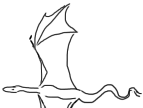
I thought the wings needed a bit more consideration, so I looked up bat wings and extrapolated from there. I'm not sure if the two layers of shoulder blades would work, but the big green one mimicks the placement of a bat's shoulder blade, so I'd imagine you'd wind up having a beefier shouldered dragon once you put the muscles and skin back on. The wing-fingers, too, I was looking at a bat's wing and noted that its forefinger has no extra joints -- I imagine that gives it better ease of flight in the air. Its middle finger, then, would be the mainstay of the wing sail, so I made it the beefier finger (ha ha, it's weird to write that!) on this template. I added a hip-spurr on for the wing sail to attach at the base of the dragon, though alternately you could have anchor points on the spine or the heel, depending on how little butt-drag you want to imagine your dragon having when in flight. (I imagine that having the spur on the heel wouldn't help too much, given that there aren't really anchors to keep the legs from getting tugged around, too. XD Epic thigh strength?)

I fiddled with the legs and toes, modeling the skeleton off of a dog's frame, since this drawing seemed to be more canine based to me. The biggest changes were in the heels and knees, as well as the toes, which didn't have all of their knuckles yet in the original image. I also shrunk the base of the tail so that it was thinner, though the tail behind its legs is really crappy, I apologize -- I was just considering how thin it would be after a the tail started out thinner.

Dray's Massive TL;DR Dragon Template Tutorial
One way that you could skip the inking step is simply by drawing clean, dark lines with your pencil -- similar to inking but without the stress of actual inking. When you scan your image into Photoshop, select from the top: 'Image'->'Adjust'->'Levels' (or alternately hit the keys 'ctrl' and 'L' -- or 'apple' and 'L' if you're on a mac). Bring the white pointer on the right and the black pointer on the left in towards the center of the scale until your image looks appropriately white-background, black-lines. The grey pointer in the center of your levels chart can be adjusted as well if the lines are looking /too/ dark. Once that's done, you can erase the background in a couple of different ways. The first way is, select the background eraser tool (it should be grouped with the regular eraser tool) and make the brush the size of the whole canvas (you can hold down the ']' key to make the brush larger, and the '[' key to make it smaller,) Make sure that the colours on your palette are set to black and white. (If not, you can press 'd' to automatically reset the palette to black in front and white in the back.) Click your mouse anywhere that there's white on the image, and keep erasing if you don't get it all on one go -- since black is at the front of the palette and white is at the back, the program assumes you just want to get rid of the white. You might run into a problem where only the background outside of the image is actually being erased -- if this happens, it means that your limits are set to 'contiguous', which means that they respect any sealed shapes by not fucking with them. In that case, look towards the top of the program and change this setting to 'discontiguous'. You can fix any fill bucket weirdness the same way, later on.

The second way that you can get rid of the white backgroundof the image is, after adjusting the levels, find the tab that says 'channels' -- it should be in the same area as your 'layers'. When you have the 'channels' open (you should see something that looks like layers labelled 'RGB', 'Red', 'Green' and 'Blue',) there is a little symbol at the bottom that looks like an 'O' that is made of dots. Click that. Everything except for what is black in the image should be highlighted. Now hit 'delete', and it should all vanish. Go back to your 'Layers' panel and create a new layer. Group it with the layer containing the lineart, ('ctrl' + 'alt' + 'g' if you're using keystrokes,) and flood fill that layer with black. This should help to darken up the lines a bit if removing the pale background made them look grayer. You can then merge this flood-filled layer down ('ctrl' + 'e') and, wham, lineart ready to go.

At this stage, you can do a couple of things to help expediate the colouring and shading process. I usually start this way:

Using the magic wand tool, adjust it's settings so that tolerance = 0 or 1, anti-alias is off, contiguous is selected. Select anywhere outside of the dragon image. Now, invert the space of the selection 'Select -> Inverse' from the tool bar, or 'ctrl' + 'shift' + 'i' via keyboard.

Create a new layer, and drag it underneath of the lineart. Fill it with some mid-grey or dull colour. If it appears that there are specks of colour outside of the lineart, select anywhere outside of the fill-bucket layer, then 'Select->Modify->Expand' and set the field to 1. Hit 'delete'. It should take care of most of the stray coloured pixels, though you'll have to go in and erase the bits between parts that the wand didn't reach, like between toes or strands of hair, in some examples. In places where lines are very thin, you may need to go in with a brush and fill that area out a little, too.

Transparency lock this dull grey/coloured layer. Name it 'Base' or whatever you like. It's your base colour, and whenever you want a differently coloured dragon, just flood fill that sucka.

You can either shade things next (sometimes it's easier to decide what kind of shading you need when everything's one colour!) or block out each chunk, like wing-sails or patterns. If you're doing the latter now, make sure that you create a new layer for each differently coloured section, and group it with the 'Base' layer -- 'ctrl + alt + g'. Don't worry too much about the final colours yet!

If you're shading, I've found a very quick and handy (but not as accurate or, ultimately, aesthetically pleasing) way to do it that's satisfactory if you're looking for speed over polish. Create a new layer above the base layer and any other colour layers you may have created. You don't need to group it with anything at this time. Set you fill bucket to Opacity: 10-30%, tolerance: 1, anti-alias should be selected. Deselect 'contiguous' so that it will fill everything at once... now take your lasso tool. Decide which direction the light is hitting your dragon, and select the areas in big chunks (Using 'shift + mouse click' to create multiple selections without borking the last area you etched out!) until you're satisfied that all of the areas that the light would generally hit are selected. Fill the area with white -- it should make everything just a little paler, since the layer is semi-transparent. Create a new layer and repeat this step twice more, on each layer using the lasso tool more precisely -- first layer is for general lighting, second layer for bigger chunks of highlights, and third chunk for details. If you want to add more layers, you can! Once all of your light layers are finished, merge them together 'ctrl + e' into one layer -- save it for now.

Begin the same process for shadows, only using black to fill. It's okay if the black and white overlap -- this doesn't have to be precise! Once you've finished, merge all of the shadow layers together. Duplicate your light layer and your shadow layer (select each layer, then use 'ctrl + j') and move these new, copied layers on top of the originals. In this order, do the following:

1) Set the copied light layer to 'Soft Light' from the layers drop down menu. Create a new layer overtop of it, and group this new layer with the copied light, then fill the empty layer with a pale colour of your choice -- usually yellow, but it can be something else if you want to mess around! Merge these two layers ('ctrl + e') and transparency lock the copied layer. You may want to rename the layer 'extra light' or something similar.*
2) Set the copied shadow layer to 'Multiply' from the layers drop down menu. Create a new layer overtop of it, group this new layer to the copied shadow, then fill the empty layer with a greyish blue or purple -- though again, you can use any colour to get slightly different hued shadows. Merge this layer down into the copied shadows and rename the layer 'extra shadows'.*
*You may wish to fiddle with the opacity of these two layers at times, as on very dark dragons the 'extra light' is going to seem overbright, and on very pale dragons, the 'extra shadow' is going to seem very dark.
3) Set the original light layer to 'overlay'.
4) Set the original shadow layer to 'overlay'.

Transparency lock every layer you intend to play with, then flood-fill ('ctrl + g') with whatever colour you like. If you don't think the colour you used is quite right, hitting 'ctrl + u' will bring up hue/saturation/lightness options, and you can fiddle with those three settings to make the colour just what you want.

If you're looking for one last step to put some quick polish on your image, find a subtle grunge image care of google or cgtextures.com. On a layer below the shading but above the colours, paste the texture image in and set it to about 10% transparency, then fiddle with the layer options (multiply, screen, overlay, soft light, etc.) until you get an effect that you like. Then churn out the dragon images and that's that!

TL;DR: Lots of photoshop shortcuts and process to go from scanned in image to finished thing!

PS: Despite your self-said rustiness, the original image looks really good, and I don't see that it really needs a tonne of red-lining. :D Did you do the original FireRidge dragons? I always adored those.
delyar
Dragon
Posts: 732
Joined: Wed Jul 06, 2005 12:08 pm
Location: Ottawa, Ontario
Contact:

Re: Crit my shi... I mean stuff! :D

Post by delyar »

This is ridiculously helpful, Dray. Thanks for writing it all up.
Character Listing
Site Listing - Links to All Sites (Link back here if confused!)
erinnyes
Egg
Posts: 20
Joined: Tue Jul 05, 2011 10:02 pm

Re: Crit my shi... I mean stuff! :D

Post by erinnyes »

I think those changes are just what it needed!! :) Especially the legs... there was something going on with them that I couldn't figure out, like the stance seemed too wide in the back, if that makes any sense? Drawing legs has never been my thing! They look much better the way you fixed them. And I really think the revisions you made to the wings are awesome! I think (since I have no tablet skills) what I might do is print out the revised image and trace over it to do my revisions, which will sort of help with the final process anyway of cleaning up the lines. I'll figure out a good place for the spurs you told me about, but to be honest they look just fine on his butt there. XD I'm actually going to really enjoy redoing the wing, because in this whole process it was the one thing I really was iffy on the anatomy of. I used to just "wing it" (pun intended) when I drew them on dragons in the past. It'll be nice to have an actual plan for them in the future. XD

Wow! Thank you so much for all the info! I am going to use that as a tutorial when I am finished with the picture and ready to scan. That is going to help LOADS with all the stuff I have to do, and if I can skip inking that is a huge headache I can avoid. Inking is actually 100% of the reason I didn't submit a winter gather critter for 2010. I drew the template, lined it, but the inking didn't work out. I didn't have a good pen and it looked ridiculous. Maybe I'll break that picture out again and see if I can still do something with it, armed with a different approach. ;)

Thank you so much for all your help! :D You obviously put a lot of thought and effort into it and I really, really appreciate it! It's really helped my motivation to do more art, now that I feel like I can get it on the computer and try and improve my creatures anatomically. I will post again when I have this guy scanned and whatnot, shouldn't take me too long!
delyar
Dragon
Posts: 732
Joined: Wed Jul 06, 2005 12:08 pm
Location: Ottawa, Ontario
Contact:

Re: Crit my shi... I mean stuff! :D

Post by delyar »

Problem attempting to follow this that is likely very simple: I'm at the "set the copied highlights layer to soft light, group it with a layer filled with pale yellow and then merge it down". It really tints my dragon all strange and fills the entire frame. What am I missing?
Character Listing
Site Listing - Links to All Sites (Link back here if confused!)
User avatar
Dray
Dracolich
Posts: 9386
Joined: Wed Jul 06, 2005 11:16 am

Re: Crit my shi... I mean stuff! :D

Post by Dray »

Switch the layers around so that the flood-filled frame is grouped over-top of the layer that has your lights. The flood-filled frame should be set to 'Normal', and after it's merged down, set the resultant tinted layer to 'soft light', then set it to about 10%. I go in and mess with the opacities of all of the light and shade layers depending on the colour and tone of the dragon... on dark dragons the light layers look really bright, or alternately don't show up at all, and on light dragons they seem to fade away. You can also play with the hue of the 'soft light' layer to change it from a yellowish tone to something more suitable for your dragon's colour -- a blueish hue, for example, would lend a cooler light but would make a blue dragon look more vibrant!
delyar
Dragon
Posts: 732
Joined: Wed Jul 06, 2005 12:08 pm
Location: Ottawa, Ontario
Contact:

Re: Crit my shi... I mean stuff! :D

Post by delyar »

But the flood-filled frame affects the entire dragon not just the highlights, which is my main problem. Or should I have selectively filled it? I am confused. :S
Character Listing
Site Listing - Links to All Sites (Link back here if confused!)
User avatar
Dray
Dracolich
Posts: 9386
Joined: Wed Jul 06, 2005 11:16 am

Re: Crit my shi... I mean stuff! :D

Post by Dray »

Hmm, you copied the light layer, and then grouped the flood-filled layer with the copied light layer? Alternately, you could transparency lock the copied light layer and use the fill bucket on it, but I've had issues with that method in the past.
delyar
Dragon
Posts: 732
Joined: Wed Jul 06, 2005 12:08 pm
Location: Ottawa, Ontario
Contact:

Re: Crit my shi... I mean stuff! :D

Post by delyar »

It seems like grouping does nothing on my Photoshop. It just puts them in a folder together, but the layers still affect everything else.
Character Listing
Site Listing - Links to All Sites (Link back here if confused!)
User avatar
Dray
Dracolich
Posts: 9386
Joined: Wed Jul 06, 2005 11:16 am

Re: Crit my shi... I mean stuff! :D

Post by Dray »

Ahh, you're putting things into a folder instead of grouping them -- I understand! Okay, here are some images -- I'm going to borrow Kitsuneko's latest dragon since I already had it out to make a thumbnail of his head for my index.

Image
This is my general layout -- the layers are on the right bottom, tools on the left, and everything else handy up top.

Image
Create a new layer over top of the original one -- in this case, just the circled button at the bottom, but in your case, a copied light layer.

Image
To group a layer, go into 'Layers' -> 'Group'. You can also use the keystrokes 'ctrl + alt + g' in newer versions of Photoshop (CS2 and higher, I think) or 'ctrl + g' in earlier versions.

Image
When you use the fill bucket in this new layer, it will floodfill the entire layer, but since it's grouped, only the parts visible on the layer below it should show changes.

Putting images into group folders is an irritatingly similar thing that's used (as far as I can tell) mostly for management if your file is getting huge. You can also duplicate a group in a folder, or drag a folder from one palette to another... but you could just as easily do that by selecting each layer and dragging the whole lot over. 9.9 Photoshop is dumb sometimes.
delyar
Dragon
Posts: 732
Joined: Wed Jul 06, 2005 12:08 pm
Location: Ottawa, Ontario
Contact:

Re: Crit my shi... I mean stuff! :D

Post by delyar »

..So they have two very different things named the same thing. That's inconvenient!

Thanks for the pictorial how-to, Dray. That really clears it up.
Character Listing
Site Listing - Links to All Sites (Link back here if confused!)
User avatar
Dray
Dracolich
Posts: 9386
Joined: Wed Jul 06, 2005 11:16 am

Re: Crit my shi... I mean stuff! :D

Post by Dray »

It took me ages to figure out what the heck was going on when they changed over the grouping key strokes, since I'd never used folders before. D: Suddenly I couldn't group layers with the ones below them anymore, and it made drawing hell!
delyar
Dragon
Posts: 732
Joined: Wed Jul 06, 2005 12:08 pm
Location: Ottawa, Ontario
Contact:

Re: Crit my shi... I mean stuff! :D

Post by delyar »

Yeah I spent a good 2 hours today being really irritated with Photoshop. It seems like I can't finish a template without getting really really aggravated and hating it. :/
Character Listing
Site Listing - Links to All Sites (Link back here if confused!)
User avatar
Dray
Dracolich
Posts: 9386
Joined: Wed Jul 06, 2005 11:16 am

Re: Crit my shi... I mean stuff! :D

Post by Dray »

I feel that way about most non-Nexus stuff these days. :c I think it's just a phase that you need to work through to get things done and to the next level.
erinnyes
Egg
Posts: 20
Joined: Tue Jul 05, 2011 10:02 pm

Re: Crit my shi... I mean stuff! :D

Post by erinnyes »

Okay, I was pencilling the wing and had a question! When drawing the wing I always imagined the first wing-finger as being the longest one, but in the redline it appears to be shorter than the rest. Structurally it looks correct, so I am making sure before I finish it that I am interpreting it right! With the way I have it right now, the spread wing would look something like this:

Image

Did I interpret it correctly? Should it be longer? Also I apologize for the crappy doodle. XD Technically I got the proportions wrong and the elbow joint should be higher up, but the shape is still more or less right.

Thank you for reading!! :)
User avatar
Dray
Dracolich
Posts: 9386
Joined: Wed Jul 06, 2005 11:16 am

Re: Crit my shi... I mean stuff! :D

Post by Dray »

That's how I've been drawing them, though looking at bat reference images it looks like the first digit is attached to the second, which is the longest, but the first digit only has one knuckle and the entire bone is bowed. I imagine that creates a little flap for more accuracy in flight!
Post Reply