Grrr...HELP!

Come and show off your masterpieces!

Moderators: Mystic Dragon, Xalia, Shard, Dray

Post Reply
User avatar
Yakima
Ancient Dragon
Posts: 3824
Joined: Wed Jul 06, 2005 12:17 pm
Location: Minnesota, USA
Contact:

Grrr...HELP!

Post by Yakima »

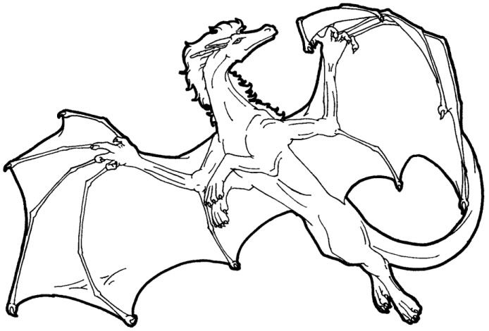
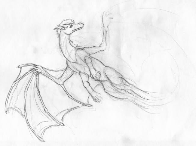
Okay, I decided to redraw some of my old templates for species connected with the Oddessy. Il'arta is done, Asper'dal started, Tajsar being a pain in the butt...I'm stubbornly trying to keep as much of the original pose on the Tajsar 'cause I do like it (Il'arta didn't get the privilege but I like the new one better anyway)...

So, here is the old one:
Image
(Really bad anatomy...:P)

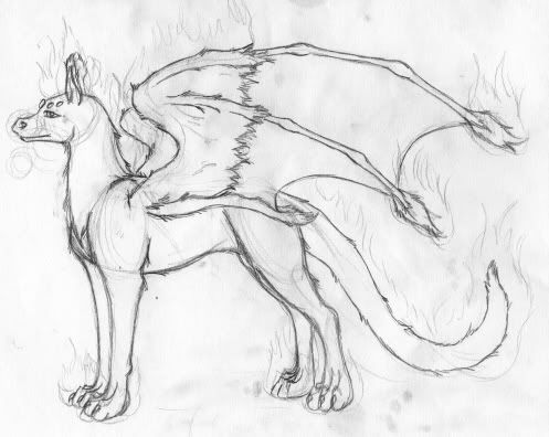
And here is the sketch for the new one:
Image
need help with the legs, mainly the front. I think I can have the body twisted a bit for the back legs like the original but we'll have to see. I have trouble with forward views (hence why most of my dragons are in profile........) So any help would be very, very welcome. :D
~ Weyrwoman Yakima of Isla Weyr

Isla Weyr: http://www.isla.mage-circle.com
Velare Isle: http://www.velare.mage-circle.com
Treval Dragonry: http://www.treval.mage-circle.com
Alair WolfKeep
The Last Oddessy: http://www.last-oddessy.mage-circle.com
Baskar Castle: http://www.baskar.mage-circle.com
World of Sentra: http://www.sentra.mage-circle.com
User avatar
Shard
Great Wyrm
Posts: 8950
Joined: Wed Jul 06, 2005 11:21 am
Location: San Diego CA
Contact:

Post by Shard »

Honestly I love the old one.

The new one's left (it's right) forelimb is just too low and too long, I think. The shoulders seem to be in the right places but then it appears to have grown another joint somewhere along the way. The paw maybe should be coming from that last major darker joint. I realize that the other one is bending the other direction and coming at us, it just doesn't look that way. The pose on the original is simple, but dynamic, and the only thing I'd say is perhaps use that one, but try and change the direction of the head so it's more in line with its paws... ;)

Really, I do like the original more.
Author of Repurposed
kshau-protectorate.com
User avatar
Dray
Dracolich
Posts: 9388
Joined: Wed Jul 06, 2005 11:16 am

Post by Dray »

I think the original has great merit, as well! If anything, I think that it would be interesting to keep the original and draw a second pose! You could then swap between the two, use one for females and one for males, or make one of them a 'limited time only' sort of collectors edition, etc. It's interesting that you're trying to keep to the same pose for each species, though having two to alternate between would be awesome. X3
User avatar
Yakima
Ancient Dragon
Posts: 3824
Joined: Wed Jul 06, 2005 12:17 pm
Location: Minnesota, USA
Contact:

Post by Yakima »

Image
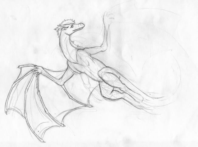
Update

Well, if everyone would rather I keep that one fine. I don't like it. Nothing looks right to me and I never tried when I drew it. I threw it together. A lot of my old templates bother me. I redid the Treval ones.

I dunno. *goes off to work*

[sorry, i am a bit crabby so I'll leave before I take it out all of you again... :(]
~ Weyrwoman Yakima of Isla Weyr

Isla Weyr: http://www.isla.mage-circle.com
Velare Isle: http://www.velare.mage-circle.com
Treval Dragonry: http://www.treval.mage-circle.com
Alair WolfKeep
The Last Oddessy: http://www.last-oddessy.mage-circle.com
Baskar Castle: http://www.baskar.mage-circle.com
World of Sentra: http://www.sentra.mage-circle.com
User avatar
Shard
Great Wyrm
Posts: 8950
Joined: Wed Jul 06, 2005 11:21 am
Location: San Diego CA
Contact:

Post by Shard »

*hugs* Don't forget that every artist is their own worst critic. :) I've always loved that template, I think it's very pretty and dynamic.

If you feel you just 'threw it together', might I suggest - relax :) Don't try too hard to get a new pose done, just let the lines go where the will. Trying to get something to be "perfect" is never, ever going to work for ANYONE, because perfection is always changing, and never the same for any two people. :)
Author of Repurposed
kshau-protectorate.com
JKatkina
Ancient Dragon
Posts: 2418
Joined: Wed Jul 06, 2005 12:37 pm
Location: Canadia
Contact:

Post by JKatkina »

Aw man, I liked what you had going with the new one! :C Two critics does not "everyone haets it" make. I thought you took more risks with the re-do, and I liked the forelimbs. (I can't see what you meant by 'too many joints', Shard -- maybe some redlining would help?)
Image Image Image Image
User avatar
StarFyre
Ancient Dragon
Posts: 3246
Joined: Wed Jul 06, 2005 10:44 am
Location: Middle of Nowhere
Contact:

Post by StarFyre »

I think the new one is generally looking good as well - the only thing that the old one has over the new (in my humble, humble opinion =P ) is that the old one has this cool, sly look, while the new one is sorta goofy and happy. Not that that's bad, but I like the sly-ness personally =P
JKatkina
Ancient Dragon
Posts: 2418
Joined: Wed Jul 06, 2005 12:37 pm
Location: Canadia
Contact:

Post by JKatkina »

StarFyre wrote:I think the new one is generally looking good as well - the only thing that the old one has over the new (in my humble, humble opinion =P ) is that the old one has this cool, sly look, while the new one is sorta goofy and happy. Not that that's bad, but I like the sly-ness personally =P
That actually would be the one and only thing about the old one I like better. Take the head shape and eye style of the first one, plonk 'em on the new one, and it'd be perfect. :D Or better yet, blend the two eye styles. You have a tendency to do eyes from the side as these triangular shapes, Yakima, which is more accurate in some ways but because you draw them so large, and with absolutely no taper on the front side (there'd be a little), they tend to look a little cartoonish. Try narrowing the eyes and adding a small amount of taper on the wide end and see how it changes the look! :3

*eta* I gotta say, Yakima. Wow, you have gotten SO MUCH BETTER at torso, chest, shoulder and belly areas. High five!
Image Image Image Image
User avatar
Yakima
Ancient Dragon
Posts: 3824
Joined: Wed Jul 06, 2005 12:17 pm
Location: Minnesota, USA
Contact:

Post by Yakima »

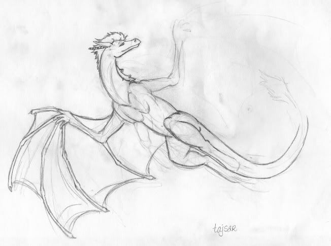
LOL, the funny thing is, after i posted that and ran off to work (which absolutely sucks and has me highly stressed, btw, so sorry if i was snappish...i got their and it only got worse...blah)...I actually changed the head on the new one because I did like the head of the original (the head and the wing-hands and wings are really the only things I like about the old one). And yes, JKat, I the eyes needed to be fixed. :P I really just need the front legs figured out and I'll have it. :P I don't know if I like the eyes just yet but yeah...

Oh, and red-lines are very helpful 'cause I'm not too sure I understand what was being said. >.<
Image


And while I'm at it, here is the new il'arta image. I tried to do the sitting position but I kinda like the regal look in this one, and the smug look on it. The old one just looked....pissed. *blink* I found a real dog image to look at for this one, since they are more canine-ish (with feline-ish colorations...go figure)...
Image


Actually, Shard, I know I probably did throw this one together 'cause it was drawn for one of the Monthly Exchanges and I wasn't pleased when I did it back then but I didn't really have time to fix it. :P And it's not that I'm trying to get the pose done, I just don't know much about the angles for the legs in this pose. *shrugs* :P
~ Weyrwoman Yakima of Isla Weyr

Isla Weyr: http://www.isla.mage-circle.com
Velare Isle: http://www.velare.mage-circle.com
Treval Dragonry: http://www.treval.mage-circle.com
Alair WolfKeep
The Last Oddessy: http://www.last-oddessy.mage-circle.com
Baskar Castle: http://www.baskar.mage-circle.com
World of Sentra: http://www.sentra.mage-circle.com
User avatar
Dray
Dracolich
Posts: 9388
Joined: Wed Jul 06, 2005 11:16 am

Post by Dray »

When I get back home and have access I'll try'n do a red-line if I can for you, Yakima! The new eyes and hands and such look really great, though, I think that you're on the right track!

The new Il'arta image is looking fantastic, too! :D Great work so far!
User avatar
Yakima
Ancient Dragon
Posts: 3824
Joined: Wed Jul 06, 2005 12:17 pm
Location: Minnesota, USA
Contact:

Post by Yakima »

Speaking of the Il'arta...you gonna let me in on your secret for awesome fire? :lol: I think I have the top arm figured out...shortened it and it made sense now. It's the other one on the bottom that I'm still confused on but a red line for both wouldn't hurt. XD

I tried to find a tube or transparent png for fire online but everything useful was photoshop...I use PSP. :(
~ Weyrwoman Yakima of Isla Weyr

Isla Weyr: http://www.isla.mage-circle.com
Velare Isle: http://www.velare.mage-circle.com
Treval Dragonry: http://www.treval.mage-circle.com
Alair WolfKeep
The Last Oddessy: http://www.last-oddessy.mage-circle.com
Baskar Castle: http://www.baskar.mage-circle.com
World of Sentra: http://www.sentra.mage-circle.com
User avatar
Shard
Great Wyrm
Posts: 8950
Joined: Wed Jul 06, 2005 11:21 am
Location: San Diego CA
Contact:

Post by Shard »

http://droppin-the-fork.com/tmp/EyeCandy3_Win.zip

:)

It SHOULD be the stuff that I use for my newer textures and fire, etc. If it turns out as a 'demo' of eyecandy 4k or some other thing, just say so. I am pretty sure this is just the freebie version of a slightly older edition of eye candy.

It goes in the Plugins directory.
Author of Repurposed
kshau-protectorate.com
User avatar
Dray
Dracolich
Posts: 9388
Joined: Wed Jul 06, 2005 11:16 am

Post by Dray »

I made a bunch of brushes for photoshop back when I was at ACAD by taking a real brush and stamping it all over a piece of paper with different colours of ink, then scanning it in and defining brush shapes with it -- not sure how that would translate via PSP, though!

Anyways, once I had the brushes, I started stamping them where I wanted the fire to be, then used an eraser with a similar function to take chunks out -- I tend to keep a couple of reference images open next to the picture to make sure that it looks okay!

Once that's done, I take a transform tool and warp the edges of the fire (selecting just the edges I want to warp, of course!) and make the edges bend with motion that suits the picture. I then duplicate the layer twice: all three layers are set to 'hard light' with the bottom-most layer being darker (and with the 'outer glow' effect added!) The middle layer is a brighter tone. The top-most layer I blur a little and make the brightest colour, then set to about 20% transparency.

That's what I've been doing lately, though I tend to change my methods with each new thing I do, since I tend to forget what I had tried, or else find something better!
User avatar
Shard
Great Wyrm
Posts: 8950
Joined: Wed Jul 06, 2005 11:21 am
Location: San Diego CA
Contact:

Post by Shard »

Photoshop anything doesn't go with PSP unfortunately. In theory the same ideas work, just not the actual files and formatting. Sucks. Pretty much everything on DA is distributed for PS not psp. But hopefully eyecandy will be of help.
Author of Repurposed
kshau-protectorate.com
User avatar
Yakima
Ancient Dragon
Posts: 3824
Joined: Wed Jul 06, 2005 12:17 pm
Location: Minnesota, USA
Contact:

Post by Yakima »

Oh, that's neat, Shard. *plays with it a bit* I'll have try that when I get the new template. Though, a picture tube type thing would probably work better....hmmm...even if i found a png of something like this: http://www.giveupalready.com/content.ph ... p-Tutorial I could convert them to a tube. :P

*goes to take a nap* :P
~ Weyrwoman Yakima of Isla Weyr

Isla Weyr: http://www.isla.mage-circle.com
Velare Isle: http://www.velare.mage-circle.com
Treval Dragonry: http://www.treval.mage-circle.com
Alair WolfKeep
The Last Oddessy: http://www.last-oddessy.mage-circle.com
Baskar Castle: http://www.baskar.mage-circle.com
World of Sentra: http://www.sentra.mage-circle.com
User avatar
Shard
Great Wyrm
Posts: 8950
Joined: Wed Jul 06, 2005 11:21 am
Location: San Diego CA
Contact:

Post by Shard »

To my recollection, PSP does come with a tube of flames, which you can recolor. IMO they're not as good as making them wider or different colors by hand though. I did recolor mine, but meh. I use the flame tool on that plugin ;)
Author of Repurposed
kshau-protectorate.com
JKatkina
Ancient Dragon
Posts: 2418
Joined: Wed Jul 06, 2005 12:37 pm
Location: Canadia
Contact:

Post by JKatkina »

The best way to do fire will always still be to look at a picture of fire and try to emulate it by hand. XD /purist

If you're uncertain, search for as long as it takes to find a reference picture, or a handful of reference pictures, that duplicate as close as possible the effect you want to achieve. It can be done! :D
Image Image Image Image
Post Reply