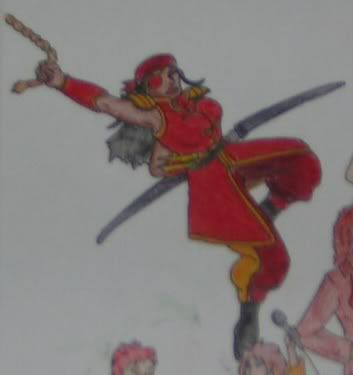
Just want some input on this pic :B Is of scaly and furry Psychic Rubans fighting. ^^ Colored pencil.
I'm just so proud. X3 Now I know the tuscan red was a mistake before I realized the color scheme I was using was that one where you pick a color (in this case purple) and the three colors opposite it (in this case yello-orange, yellow and yello-green), but mebbe I'm missing something. Input pleez. *snugs you all*
You know what, Tuscan red NEVER goes with ANYTHING when I use it either. It's too rich a color but it falls so weirdly between red, violet and brown-orange.
Great work! Very nice. It's a little hard to understand why the furry one's hind paw is way back there though.
Paws could use some work, but the faces are lovely, especially the furry one's. >_>" Might want to work on smoothing out that background, too, as right now it looks very rushed.
Wait... CD... O_o Did you reference off of anything for this image? *seeing very strong references to an image of hers from ages ago in that scaly guy*
My comment would be: great job on the detail inking, though the coloring could be a little smoother; and why are we looking 3/4 view front at the lavender fellow's face, when, if he were looking at his opponent, we should be seeing 3/4 back view? Admittedly, 3/4 back view is hard, but.... XD
Cacopheny wrote:My comment would be: great job on the detail inking, though the coloring could be a little smoother; and why are we looking 3/4 view front at the lavender fellow's face, when, if he were looking at his opponent, we should be seeing 3/4 back view? Admittedly, 3/4 back view is hard, but.... XD
He could be turning away from his opponant, and not looking at him.
The only thing I think really needs some work is the wing on the scaly one. Either you should highlight at least one more inner spar, or change the lighting. If he's flying on a full-sail wing with only an outer spar along the edge, it shouldn't sink in the way the lighting makes it look if it's holding his weight.
S.R. / Coeptus Weir
~*~
Before she turns, rose-thorned tail streaking my hood,
I glimpse from her a thought like jagged glass,
Yet delicate with the texture of sentience:
We remain "turtle-apes", only the shells of our armors grow.
-My Bones Waxed Old by Robert Frazier
Ooooh... very pretty. My only contribution would be to add some highlighting coming off those magical attacks. It took me a while to figure out where they were coming from.
I didn't even know tuscan red *was* in that color range. O_o at the time I thought it'd just look good since there would be yellow-orange in the pic. +ack+
The background was a pain in the neck- I blended it a lot but it just would. not. blend. enough. *swats his two blenders* For some reason the yellow colors kept giving me too much wax bloom. TT
To Dray: What scaly pic? O_o He's 100% scaly Psychic Ruban straight out of my head. o.o *blinks*
As for the wingage: I had a lot of problems with it! There were two light sources too- the breath weapon and shield glowiness and the sunset.
... There's a breathweapon and a shield, am I correct? I did not really even see those.
A much darker background would probably do better here. Brown, neutral color, not something so vivid that it would conflict with the scales color value. Otherwise I think everything that's been said is right on.
And yeah, tuscan red,
it's number 937 on this chart (which isn't all that great) http://www.marcopaper.com/prismacolorchart.gif But it's a completely different color in oil paint (a far more rasberry/pinkish shade)
I used it as shading on this piece, and it ... isn't all that great. Alone, it's a fantastic color, but it just doesn't mix very well.
I'd been thinking sunset-yellow/purple/yellow-orange-yellow-green color scheme since I'd finished reading a color theory book, but XD Apparently it didn't do so well.
And yeah.. I tried to make the breath weapon and shield work out, but freaking wax bloom wouldn't lemme even when I rubbed it off..
lol I own like, every brand of pencil... I have about a dozen different blacks, each of which is very different (some pale, some very heavy pigment, some scratchy, etc). All in a big box, rubberbanded together by color group. I only ever use them for that picture (the 'many of me' picture, http://www.geocities.com/the_endings/ ) but still, I love colored pencils. That annoyingly rasberry shade of red is so hard to work with though. For me anyway.
Well, I own all those. And then others by the handfull. *some* crayola brand pencils are good, at least their color is nice, while others aren't so great for texture purposes. I agree though the prismas are very thick, heavy pigment. Sometimes TOO heavy: do you notice how often peacock blue/green pigment breaks in the pencil??
I prefer prismacolors myself, but when I don't want to go through the work of blending since they get rather...grainy...if you don't, then I prefer roseart or crayola. They're really not too bad. Also what are called "oil pencils" by Walnut Hollow, work almost like prismas and are a little cheaper. Colors aren't as nice though.


